はじめに
こんにちは、iOSアプリ開発グループの神山です。
SwiftUIについて絶賛勉強中なのですが、今回はButtonに関連するUIコンポーネントの作り方についてまとめてみました。
具体的には以下のコンポーネントについてご紹介していきます。
- Button
- Link
Button
ButtonはUIKitのUIButtonに相当します。
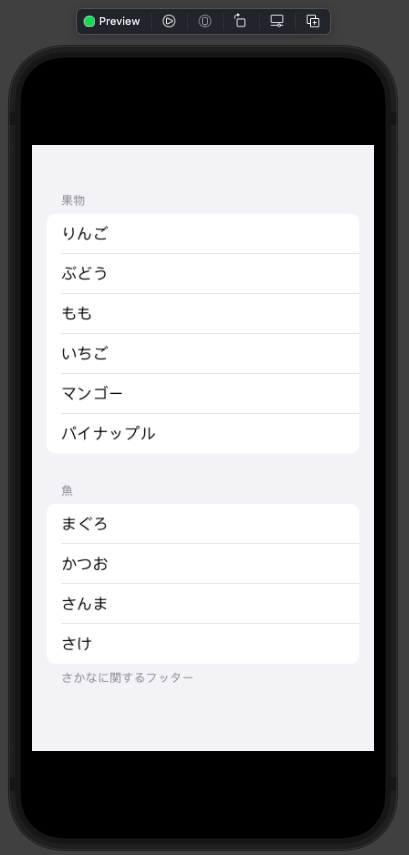
struct ContentView: View {
    var body: some View {
        VStack(spacing: 16) {
            Button("ボタン") {
                print("タップ時のアクション")
            }

            Button {
                print("タップ時のアクション")
            } label: {
                Image(systemName: "trash")
                Text("ボタン2")
            }

            Button {
                print("タップ時のアクション")
            } label: {
                Label("ボタン3", systemImage: "mic")
            }
        }
    }
}
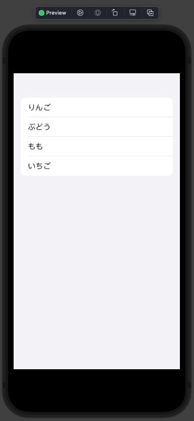
Buttonはタイトルとタップした際のアクションを設定することでコンポーネントを生成することができます。
init(action: () ->; Void, label: () ->; Label)を使用することでタイトルに文字列だけでなく画像を使用することもできます。
上記のコードをPreviewで確認すると以下のように表示することができました。
Modifier
Buttonの主なModifierについてご紹介します。
overlay()ビューを重ねる
| Rectangle | RoundedRectangle(cornerRadius:) | Capsule |
|---|---|---|
 |
 |
 |
buttonStyle()ボタンのスタイルを指定
| automatic | plain | bordered | borderless | borderedProminent |
|---|---|---|---|---|
 |
 |
 |
 |
 |
Buttonのカスタマイズ
デフォルトではModifierの
buttonStyle()にborderedやplainが用意されていますが、これらは自ら作成してカスタマイズすることもできます。
実際にButtonStyleを自作してみましょう。
struct SampleButtonStyle: ButtonStyle {
    let color: Color

    func makeBody(configuration: Configuration) -> some View {
        configuration.label
            .padding()
            .font(.title2)
            .background(color)
            .foregroundColor(.white)
            .clipShape(Capsule())
            .scaleEffect(configuration.isPressed ? 0.9 : 1)
    }
}
configuration.isPressedでボタンをタップしている状態かどうかの判定をすることもできます。
実際にPreviewで確認してみましょう。
struct ContentView: View {
    var body: some View {
        VStack(spacing: 16) {
            Button("ボタン2") {
                print("タップ時のアクション")
            }
            .buttonStyle(SampleButtonStyle(color: .green))

            Button("ボタン2") {
                print("タップ時のアクション")
            }
            .buttonStyle(SampleButtonStyle(color: .red))

            Button("ボタン3") {
                print("タップ時のアクション")
            }
            .buttonStyle(SampleButtonStyle(color: .blue))
        }
    }
}
これで複数のボタンでスタイルの共通化を行うことができるようになりました。
Link
Linkは外部ブラウザを開く際に使用され、タップした時にアクションが起きるという観点からUIKitのUIButtonと同等の機能を備えているとも言えます。
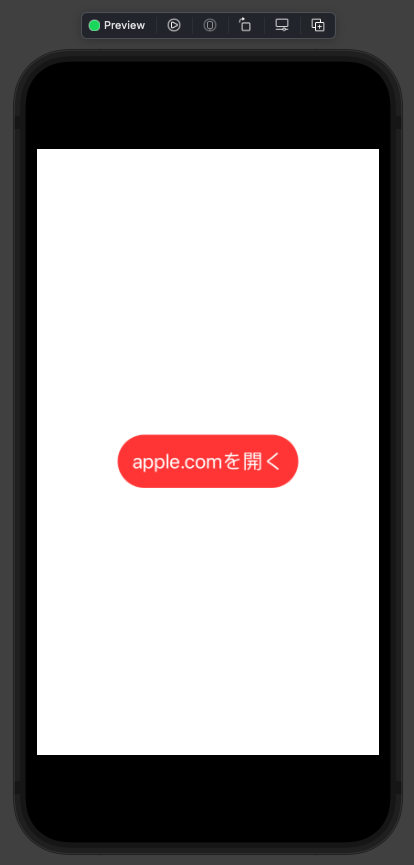
struct ContentView: View {
    var body: some View {
        VStack(spacing: 16) {
            Link("apple.comを開く", destination: URL(string: "https://www.apple.com")!)
        }
    }
}
上記のコードを確認しますと以下のように表示され、タップすることでブラウザに遷移することが確認できました。
Modifierで
buttonStyle()も適用させることができました。先ほどのSampleButtonStyleを適用させると以下のようになりました。
ちなみにUIKitと同様にボタンのアクション内に外部ブラウザを開く処理を記載することでLinkと同じように遷移させることもできます。
struct ContentView: View {
    var body: some View {
        VStack {
            Button("ボタン") {
                UIApplication.shared.open(URL(string: "https://www.apple.com")!)
            }

            Link("apple.comを開く", destination: URL(string: "https://www.apple.com")!)
        }
    }
}
さいごに
UIKitと比較してButtonやLinkは、タップした際のアクションもまとめて記載することができるのでとても便利ですね。
LinkについてはiOS14以降でしか使えないなどの制限がありますが、使用できる場合には積極的に使っていこうと思います。
最後まで記事を読んで頂き、ありがとうございました。
参考文献
神山義仁
iOSエンジニアです。

